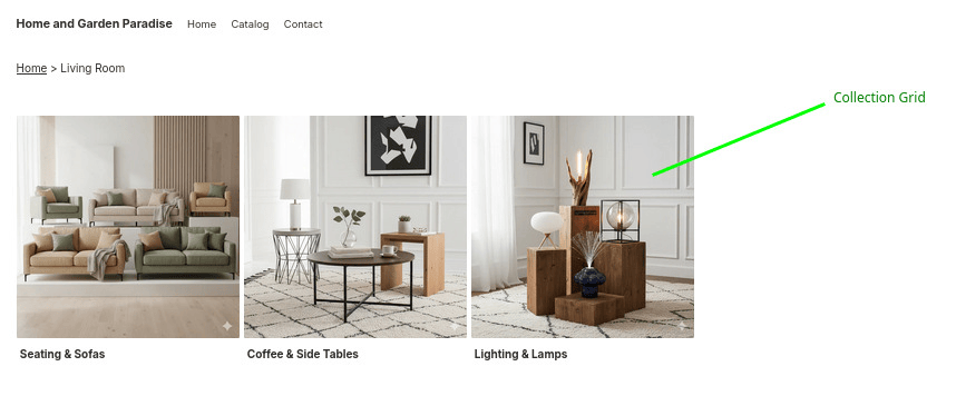
Collection Grid
Displaying Collections in Your Store
The Collection Grid app block lets you showcase collections in a visually appealing grid layout. It automatically adapts to your store's context:
- On collection pages: Displays child collections (subcollections) of the current collection
- On other pages: Shows root-level collections (those without a parent collection)
This is particularly useful when you want to display subcollection images above your product list, helping customers navigate deeper into your catalog.
Adding Collection Grid to Your Theme
How to Enable Collection Grid
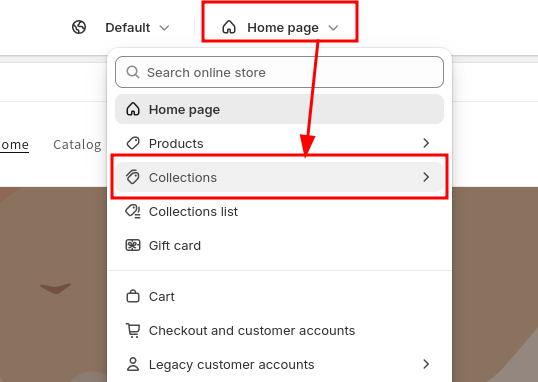
1. Open your Online Store theme editor

2. Navigate to the page where you want to add the collection grid
- For collection pages, select the Collections template from the top bar
- For other pages (like your homepage), navigate to that page
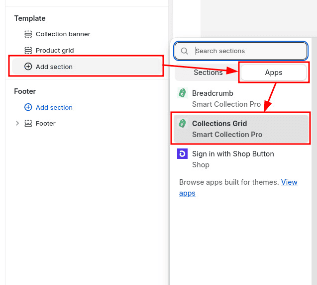
3. From the left menu, click Add block or Add section and select Collection Grid from the Smart Collection Pro app
4. Configure the grid settings from the right menu
You can adjust various settings such as spacing, layout, number of columns, and display options directly from the theme editor.

Advanced Customization
If the built-in configuration options don't meet your needs, you can use custom CSS variables to fine-tune the appearance of your collection grid.
How to Add Custom CSS
1. From the theme editor, open Theme settings (usually at the bottom of the left sidebar)
2. Scroll down to the Custom CSS section

Shopify applies a hard limit of 1,500 characters on Custom CSS. If you need more than 1,500, it's possible to update the theme's code directly. Our team can help you achieve this. Feel free to contact us.
3. Add your custom styles to the text field
Basic example - Customize title color and padding:
scp-collection-grid {
  --scp-cg-title-color: #342245;
  --scp-cg-title-padding: 2rem;
}
Advanced example - Different styles for mobile devices:
/* This is required to get the container query below to work */
.app-block-scp-collection-grid {
  container-type: inline-size;
  container-name: collection-grid;
}

/* Desktop style */
scp-collection-grid {
  --scp-cg-title-padding: 1rem;
}

/* Mobile style */
@container collection-grid (max-width: 750px) {
  scp-collection-grid {
    --scp-cg-title-padding: 0;
  }
}
4. Click Save to apply your changes
Your custom styling will now be applied to the collection grid throughout your store.
Available CSS Variables
Title Styling
| Variable | Purpose |
|---|---|
--scp-cg-title-color | Text color of collection titles |
--scp-cg-title-background-color | Background color behind titles: adapts to the title width (default: transparent) |
--scp-cg-title-wrapper-background-color | Background color behind titles: fills the whole space horizontally |
--scp-cg-title-padding | Spacing inside the title area |
--scp-cg-title-margin | Spacing around the title area |
--scp-cg-title-border-radius | Rounded corners for title background |
--scp-cg-title-text-wrap | How the title text wraps (e.g. nowrap, balance) |
Card Styling
| Variable | Purpose |
|---|---|
--scp-cg-background-color | Background color of collection cards |
--scp-cg-padding | Inner spacing of the card (must include a unit, e.g. 10px) |
--scp-cg-border-width | Thickness of card border |
--scp-cg-border-color | Color of card border |
--scp-cg-border-style | Border style (solid, dashed, etc.) |
--scp-cg-card-width | Outer width of each card |
--scp-cg-card-height | Outer height of each card |
--scp-cg-thumbnail-object-fit | How images fit within their container (cover, contain, etc.) |
--scp-cg-thumbnail-background-color | Background color behind collection images |
--scp-cg-thumbnail-height | Height of the card thumbnail area |
--scp-cg-thumbnail-display | Display mode of the thumbnail (e.g. none to hide it) |
--scp-cg-thumbnail-aspect-ratio | Aspect ratio applied to thumbnails (e.g. 1 / 1, 16 / 9) |
--scp-cg-image-width | Width of the image inside the thumbnail |
Card Inner Layout
Controls the flex container that wraps the card's contents (thumbnail, title, etc.).
| Variable | Purpose |
|---|---|
--scp-cg-card-inner-width | Width of the inner content wrapper |
--scp-cg-card-inner-height | Height of the inner content wrapper |
--scp-cg-card-inner-display | Display mode of the inner wrapper (default: flex) |
--scp-cg-card-inner-flex-direction | Direction of inner content (column, row, etc.) |
--scp-cg-card-inner-justify-content | Main-axis alignment of inner content (center, space-between, …) |
--scp-cg-card-inner-align-items | Cross-axis alignment of inner content (center, flex-start, …) |
Grid & Layout
Controls how cards are arranged on the page.
| Variable | Purpose |
|---|---|
--scp-cg-columns | Override the number of columns set in the block settings |
--scp-cg-grid-display | Display mode for the container (grid or flex) |
--scp-cg-grid-flex-wrap | Wrap behavior when in flex mode (wrap, nowrap) |
--scp-cg-grid-justify-content | Horizontal alignment of items inside the container |
--scp-cg-grid-margin-left | Left margin applied to the grid |
--scp-cg-grid-margin-right | Right margin applied to the grid |
Carousel — Navigation Buttons
Used when the block is displayed as a carousel.
| Variable | Purpose |
|---|---|
--scp-cg-carousel-button-size | Diameter of the prev/next buttons (default: 34px) |
--scp-cg-carousel-button-background-color | Fill color of the prev/next buttons (default: #FFF) |
--scp-cg-carousel-button-border-color | Border color of the prev/next buttons (default: #BBB) |
--scp-cg-carousel-button-horizontal-offet | Horizontal offset of the buttons from the carousel edge (default: 10px) |
Carousel — Arrows
Controls the chevron icon drawn inside each navigation button.
| Variable | Purpose |
|---|---|
--scp-cg-carousel-arrow-size | Length of the arrow chevron (default: 9px) |
--scp-cg-carousel-arrow-color | Color of the arrow (default: #000) |
--scp-cg-carousel-arrow-thickness | Thickness of the chevron strokes (default: 2px) |
--scp-cg-carousel-arrow-bar-thickness | Thickness of the optional arrow bar (default: 2px) |
--scp-cg-carousel-arrow-bar-width | Width of the optional arrow bar (default: 9px) |
Carousel — Scroll Indicator
The track shown below the carousel that reflects the scroll position.
| Variable | Purpose |
|---|---|
--scp-cg-carousel-scroll-indicator-display | Show or hide the scroll indicator (e.g. none) |
--scp-cg-carousel-scroll-indicator-height | Height of the indicator track (default: 5px) |
--scp-cg-carousel-scroll-indicator-background | Background color of the track (default: #DDD) |
--scp-cg-carousel-scroll-indicator-border-radius | Rounded corners for the track (default: 3px) |
--scp-cg-carousel-scroll-indicator-margin | Spacing around the track (default: 6px 0) |
Carousel — Scrollbar Thumb
The draggable handle inside the scroll indicator.
| Variable | Purpose |
|---|---|
--scp-cg-carousel-scrollbar-background | Color of the scrollbar thumb (default: #777) |
--scp-cg-carousel-scrollbar-width | Width of the scrollbar thumb (default: clamp(50px, 15%, 200px)) |
--scp-cg-carousel-scrollbar-left | Left position of the thumb (advanced; usually computed automatically) |
--scp-cg-carousel-scrollbar-right | Right position of the thumb (advanced; usually computed automatically) |
Carousel — Items
Controls the sizing of each card slide inside the carousel.
| Variable | Purpose |
|---|---|
--scp-cg-carousel-item-flex | Flex shorthand for each item (controls how slides size to fit --scp-cg-columns) |
--scp-cg-carousel-item-width | Explicit width of each carousel item |
If you need more customization, our team is happy to understand your requirements and add the necessary options. Feel free to contact us.